Martes, 01 de mayo de 2012
Nos encantan los datos y dedicamos mucho tiempo a monitorear las analíticas de nuestros sitios web. Cualquier desarrollador web que haga lo mismo habrá notado el aumento reciente en el tráfico desde dispositivos móviles. Durante el último año, hemos visto que muchos sitios clave obtienen un porcentaje significativo de visitas a páginas desde teléfonos inteligentes y tabletas. Estos representan una gran cantidad de visitantes, con navegadores sofisticados que admiten lo último en HTML, CSS y JavaScript, pero que también tienen un espacio de pantalla limitado con anchos tan estrechos como 320 píxeles.
Nuestro compromiso con la
accesibilidad significa que nos esforzamos por brindar una buena experiencia de navegación para todos nuestros usuarios. Nos enfrentamos a una elección difícil entre crear sitios web específicos para móviles o adaptar los sitios existentes y los nuevos lanzamientos para que se vean bien tanto en escritorio como en móviles. Crear dos sitios nos permitiría apuntar mejor a hardware específico, pero mantener un solo sitio compartido preserva una URL canónica, evita redirecciones complicadas y simplifica el uso compartido de direcciones web. Con miras a la mantenibilidad, nos inclinamos por usar las mismas páginas para ambos y comenzamos a pensar en cómo podríamos cumplir con las siguientes pautas:
- Nuestras páginas deben renderizarse de forma legible en cualquier resolución de pantalla
- Marcamos un conjunto de contenido, haciéndolo visible en cualquier dispositivo
- Nunca deberíamos mostrar una barra de desplazamiento horizontal, independientemente del tamaño de la ventana
Implementación
Como punto de partida, un marcado simple y semántico nos da páginas que son más flexibles y más fáciles de reorganizar si es necesario cambiar el diseño. Al asegurarnos de que la hoja de estilos permita un
diseño líquido, ya estamos en camino a la compatibilidad con móviles. En lugar de especificar ancho para los elementos contenedores, comenzamos a usar ancho máximo en su lugar. En lugar de
altura usamos altura mínima, para que las fuentes más grandes o el texto de varias líneas no rompan los límites del contenedor. Para evitar que las imágenes de ancho fijo “abran” las columnas líquidas, aplicamos la siguiente regla CSS:
El diseño líquido es un buen comienzo, pero puede carecer de cierta delicadeza. Afortunadamente, las
media queries ahora están
bien soportadas en los navegadores modernos
incluidos IE9+ y la mayoría de los dispositivos móviles. Estas pueden marcar la diferencia entre un sitio que se degrada bien en un navegador móvil frente a uno que se mejora para aprovechar la interfaz de usuario optimizada. Pero primero debemos tener en cuenta cómo los teléfonos inteligentes se presentan a los servidores web.
Viewports
¿Cuándo un píxel no es un píxel? Cuando está en un teléfono inteligente. Por defecto, los navegadores de teléfonos inteligentes pretenden ser navegadores de escritorio de alta resolución y diseñan una página como si la estuviera viendo en un monitor de escritorio. Es por eso que obtiene un “modo de vista general” con texto diminuto que es imposible de leer antes de hacer zoom. El
ancho de viewport predeterminado
para el navegador Android predeterminado es de 800px, y 980px para iOS, independientemente del número de
píxeles físicos reales
en la pantalla.
Para activar el navegador para que renderice su página a una escala más legible, debe usar el elemento meta viewport:
Las resoluciones de pantalla móvil varían ampliamente, pero la mayoría de los navegadores de teléfonos inteligentes modernos informan actualmente un ancho de dispositivo estándar en la región de 320px. Si su dispositivo móvil tiene realmente un ancho de 640 píxeles físicos, entonces una imagen de 320px de ancho se dimensionaría al ancho completo de la pantalla, utilizando el doble de píxeles en el proceso. Esta es también la razón por la que el texto se ve mucho más nítido en la pantalla pequeña: el doble de densidad de píxeles en comparación con un monitor de escritorio estándar.
Lo útil de configurar el ancho a ancho de dispositivo en la etiqueta
meta viewport es que se actualiza cuando el usuario cambia la orientación de su teléfono inteligente o tableta. Combinar esto con media queries le permite ajustar el diseño a medida que el usuario gira su dispositivo:
En realidad, puede encontrar que necesita usar diferentes puntos de interrupción según cómo fluya y se vea su sitio en varios dispositivos. También puede usar la media query de orientación para apuntar a orientaciones específicas sin hacer referencia a dimensiones de píxeles,
donde sea compatible.
Un ejemplo de media queries
Recientemente relanzamos la página
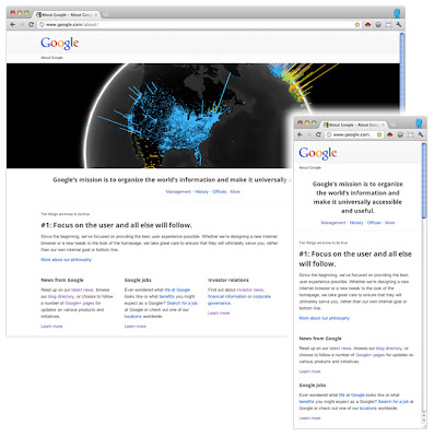
Acerca de Google . Además de configurar un diseño líquido, agregamos algunas media queries para brindar una experiencia mejorada en pantallas más pequeñas, como las de una tableta o teléfono inteligente.
En lugar de apuntar a resoluciones de dispositivo específicas, optamos por un conjunto relativamente amplio de puntos de interrupción. Para una resolución de pantalla superior a 1024 píxeles, renderizamos la página tal como fue diseñada originalmente, de acuerdo con nuestra cuadrícula de 12 columnas. Entre 801px y 1024px, puede ver una versión ligeramente comprimida gracias al diseño líquido.
Solo si la resolución de la pantalla cae a 800 píxeles, el contenido que no se considera contenido principal se enviará a la parte inferior de la página:
Con una media query final entramos en el territorio de los teléfonos inteligentes:
En este punto, ya no cargamos la imagen grande y apilamos los bloques de contenido. También agregamos espacio en blanco adicional entre los elementos de contenido para que se identifiquen más fácilmente como secciones diferentes.
Con estas medidas simples, nos aseguramos de que el sitio sea utilizable en una amplia gama de dispositivos.
Conclusión
Vale la pena tener en cuenta que no existe una solución simple para hacer que los sitios sean accesibles en dispositivos móviles y viewports estrechos. Los diseños líquidos son un gran punto de partida, pero es posible que sea necesario hacer algunos compromisos de diseño. Las media queries son una forma útil de agregar pulido para muchos dispositivos, pero recuerde que el
25% de las visitas se realizan desde navegadores de escritorio que actualmente no admiten la técnica y existen algunas
implicaciones de rendimiento. Y si tiene un widget elegante en su sitio, podría funcionar maravillosamente con un mouse, pero no tan bien en un dispositivo táctil donde el control fino es más difícil.
La clave es probar temprano y probar a menudo. Cualquier tiempo dedicado a navegar por sus propios sitios con un teléfono inteligente o tableta será invaluable. Cuando no pueda probar en dispositivos reales, use el
Android SDK o el
iOS Simulator. Pida a amigos y colegas que vean sus sitios en sus dispositivos, y observe también cómo interactúan.
Los navegadores móviles son una gran fuente de tráfico nuevo, y aprender cómo apoyarlos mejor es una nueva área emocionante de desarrollo profesional.
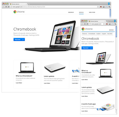
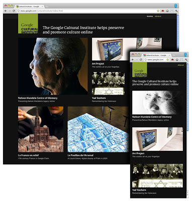
Algunos ejemplos más de diseño responsivo en Google:
- www.google.com/about/
- www.google.com/goodtoknow
- www.google.com/culturalinstitute
- www.google.com/events/sciencefair
- www.google.com/intl/en/chrome/devices
- picasa.google.com
Cómo lo aplicamos
We archive Search Central announcements because client questions often trace back to a change that was announced years ago. Reading the original is faster than reconstructing it from second-hand summaries.
Servicios relacionados