Miércoles, 22 de julio de 2020
Indexación mobile-first ha sido un esfuerzo continuo de Google durante varios años. Hemos habilitado la indexación mobile-first para la mayoría de los sitios rastreados actualmente, y
lo hemos habilitado de forma predeterminada para todos los sitios nuevos. Nuestro plan inicial era
habilitar la indexación mobile-first para todos los sitios en Search en septiembre de 2020. Nos damos cuenta de que en estos tiempos inciertos no siempre es fácil concentrarse en el trabajo como de costumbre, por lo que hemos decidido extender el plazo hasta finales de marzo de 2021. En ese momento, planeamos cambiar nuestra indexación a mobile-first.
Para los sitios que aún no están listos para la indexación mobile-first, ya hemos mencionado algunos problemas que bloquean sus sitios en
publicaciones de blog anteriores
. Ahora que hemos realizado más pruebas y evaluaciones, hemos visto algunos problemas más que vale la pena mencionar parapreparar mejor sus sitios Asegúrate de que Googlebot pueda ver tu contenido.
En la indexación mobile-first, solo obtendremos la información de tu sitio desde la versión móvil, así que asegúrate de que Googlebot pueda ver todo el contenido y todos los recursos allí. Aquí hay algunas cosas a las que debes prestar atención:
Robots
meta etiquetas en la versión móvil Debes usar las mismas
robots meta etiquetas en la versión móvil que en la versión de escritorio. Si utilizas una diferente en la versión móvil (como noindex o nofollow), es posible que Google no indexe ni siga los enlaces de tu página cuando tu sitio esté habilitado para la indexación mobile-first.
Carga diferida (Lazy-loading) en la versión móvil
La carga diferida es más común en dispositivos móviles que en computadoras de escritorio, especialmente para cargar imágenes y videos. Recomendamos seguir las mejores prácticas de lazy-loading. En particular, evita cargar de forma diferida tu contenido principal basándote en las interacciones del usuario (como deslizar, hacer clic o escribir), porque Googlebot no activará estas interacciones del usuario.
Por ejemplo, si tu página tiene 10 imágenes principales en la versión de escritorio y la versión móvil solo tiene 2 de ellas, y las otras 8 imágenes se cargan desde el servidor solo cuando el usuario hace clic en el
+ botón:

En este caso, Googlebot no hará clic en el botón para cargar las 8 imágenes, por lo que Google no verá esas imágenes. El resultado es que no se indexarán ni se mostrarán en Google Images. Sigue
las mejores prácticas de lazy-loading de Google, y carga el contenido de forma diferida automáticamente según su visibilidad en el viewport.
Sé consciente de lo que bloqueas
Algunos recursos tienen URL diferentes en la versión móvil que en la versión de escritorio, a veces se sirven en diferentes servidores. Si deseas que Google rastree tus URL, asegúrate de no estar bloqueando su rastreo con tu
archivo robots.txt.
Por ejemplo, bloquear las URL de .css archivos evitará que Googlebot renderice tus páginas correctamente, lo que puede perjudicar el posicionamiento de tus páginas en Search. Del mismo modo, bloquear las URL de las imágenes hará que estas imágenes desaparezcan de Google Images.
Asegúrate de que el contenido principal sea el mismo en escritorio y móvil
Si tu versión móvil tiene menos contenido que tu versión de escritorio, debes considerar actualizar tu versión móvil para que su contenido principal (el contenido con el que deseas posicionarte o el motivo por el cual los usuarios visitan tu sitio) sea equivalente. Solo el contenido que se muestra en la versión móvil se utilizará para la indexación y el posicionamiento en Search. Si tu intención es que la versión móvil tenga menos contenido que la versión de escritorio, es posible que tu sitio pierda algo de tráfico cuando Google habilite la indexación mobile-first para tu sitio, ya que Google ya no podrá obtener la información completa.
Utiliza los mismos encabezados claros y significativos en tu versión móvil que en la versión de escritorio. La falta de encabezados significativos puede afectar negativamente la visibilidad de tu página en Search, ya que es posible que no podamos comprender completamente la página.
Por ejemplo, si tu versión de escritorio tiene la siguiente etiqueta para el encabezado de la página:
Tu versión móvil también debe usar la misma etiqueta de encabezado con las mismas palabras, en lugar de usar encabezados como:
(no es claro ni significativo)
(no utiliza una etiqueta de encabezado)
Revisa tus imágenes y videos
Asegúrate de que las imágenes y los videos de tu versión móvil sigan
las mejores prácticas de imágenes y
las mejores prácticas de videos. En particular, te recomendamos que realices las siguientes comprobaciones:
Calidad de imagen
No utilices imágenes que sean demasiado pequeñas o que tengan una resolución baja en la versión móvil. Es posible que las imágenes pequeñas o de baja calidad no se seleccionen para su inclusión en Google Images, o que no se muestren de forma tan favorable cuando se indexen.
Por ejemplo, si tu página tiene 10 imágenes principales en la versión de escritorio y son imágenes normales de buena calidad. En la versión móvil, una mala práctica es usar miniaturas muy pequeñas para estas imágenes para que quepan en la pantalla más pequeña:
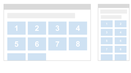
En este caso, Google puede considerar que estas miniaturas son de “baja calidad” porque son demasiado pequeñas y tienen una resolución baja.
Atributos alt para imágenes
Como mencionamos anteriormente, recuerda que el uso de atributos alt menos significativos puede afectar negativamente a cómo se muestran tus imágenes en Google Images.
Por ejemplo, una buena práctica es la siguiente (texto alt significativo):
Mientras que las malas prácticas son como las siguientes (texto alt vacío):
Aquí hay un ejemplo en el que el texto alt no es significativo:
Diferentes URL de imagen entre la versión de escritorio y la móvil
Si tu sitio utiliza diferentes URL de imagen para la versión de escritorio y la móvil, es posible que experimentes una pérdida temporal de tráfico de Google Images mientras tu sitio realiza la transición a la indexación mobile-first. Esto se debe a que las URL de las imágenes en la versión móvil son nuevas para el sistema de indexación de Google y lleva algún tiempo que las nuevas URL de las imágenes se comprendan adecuadamente. Para minimizar una pérdida temporal de tráfico de la búsqueda, evalúa si puedes conservar las URL de las imágenes utilizadas en el escritorio.
Marcado de video
Si tu versión de escritorio utiliza
datos estructurados VideoObject
de schema.org para describir videos, asegúrate de que la versión móvil también incluya el
VideoObject, proporcionando información equivalente. De lo contrario, nuestros sistemas de indexación de videos pueden tener problemas para obtener suficiente información sobre tus videos, lo que provocará que no se muestren de forma tan visible en Search.
Ubicación de videos e imágenes
Asegúrate de posicionar los videos y las imágenes en una ubicación fácil de encontrar en la versión móvil de tus páginas. Los videos o imágenes mal ubicados podrían afectar la experiencia del usuario en dispositivos móviles, lo que haría posible que Google no los muestre de forma tan visible en la búsqueda.
Por ejemplo, supongamos que tienes un video incrustado en tu contenido en un lugar fácil de encontrar en el escritorio:
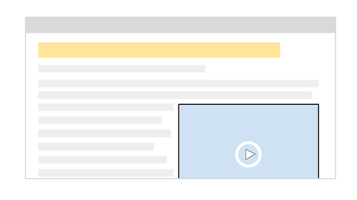
En dispositivos móviles, colocas un anuncio cerca de la parte superior de la página que ocupa una gran parte de la misma. Esto puede provocar que tu video se mueva fuera de la página, lo que requiere que los usuarios se desplacen mucho hacia abajo para encontrar el video:
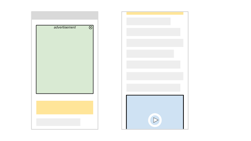
En este caso, es posible que nuestros algoritmos no consideren que la página es una página de destino de vídeo útil, lo que daría lugar a que el vídeo no se muestre en la Búsqueda.
Puedes encontrar más información y mejores prácticas en nuestra
guía para desarrolladores sobre indexación mobile-first.
La indexación mobile-first ha recorrido un largo camino. Es fantástico ver cómo la web ha evolucionado de escritorio a móvil, y cómo los webmasters han ayudado a permitir que el rastreo y la indexación coincidan con la forma en que los usuarios interactúan con la web. Agradecemos todo vuestro trabajo a lo largo de los años, que ha ayudado a que esta transición sea bastante fluida. Seguiremos supervisando y evaluando estos cambios cuidadosamente. Si tienes alguna pregunta, pásate por nuestros
foros o nuestros
eventos públicos.
Cómo lo aplicamos
We archive Search Central announcements because client questions often trace back to a change that was announced years ago. Reading the original is faster than reconstructing it from second-hand summaries.
Servicios relacionados