Donnerstag, 8. November 2018
Jeden Monat stoßen Millionen von Chrome-Nutzern auf Seiten mit unzureichenden Informationen zu mobilen Abonnements. Überraschende Gebühren, die aus unklarer Kommunikation resultieren, führen zu einer schlechten Nutzererfahrung. Deshalb wird Chrome ab Chrome 71 (Dezember 2018) vor diesen Seiten eine Warnung anzeigen, damit Nutzer fundierte Entscheidungen treffen können, wenn sie sich für mobilbasierte Abonnementdienste anmelden. Nutzern wird die Wahl angeboten, zur Seite fortzufahren oder zurückzugehen, wenn sie sich nicht bewusst waren, dass sie eine Zahlungsseite aufrufen.
Unklare mobile Abonnements
Stellen Sie sich vor: Andrea surft über eine mobile Verbindung im Internet, um auf eine Gaming-Seite zuzugreifen, und bekommt eine Seite präsentiert, die sie nach ihren Mobilfunkdaten fragt.
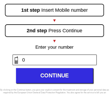
Sie füllen die Felder mit ihrer Handynummer aus, drücken auf Weiter und erhalten Zugriff auf den Inhalt.
Im nächsten Monat kommt die Telefonrechnung und sie sehen eine Gebühr, die sie nicht erwartet hatten. War das Abonnement für den Online-Gaming-Dienst wirklich so teuer? Haben sie wirklich zugestimmt, diesen spezifischen Preis für den Dienst zu zahlen? Wie viel haben sie zugestimmt zu zahlen, um auf den Inhalt zuzugreifen?
Klarere Abrechnungsinformationen für Chrome-Nutzer
Wir möchten sicherstellen, dass Chrome-Nutzer verstehen, wann sie einen Abrechnungsprozess durchlaufen, und darauf vertrauen können, dass sie beim Surfen im Internet fundierte Entscheidungen treffen können.
Um Nutzer angemessen zu informieren, ist es wichtig, ein ausreichendes Maß an Details innerhalb der Abrechnungsseite bereitzustellen, wie in unseren neuen
Best Practices für mobile Abrechnungsgebührendargelegt.
Seiten, die die folgenden Fragen positiv beantworten, bieten im Allgemeinen ausreichende Informationen für Nutzer:
- Sind die Abrechnungsinformationen für Nutzer sichtbar und offensichtlich? Zum Beispiel ist es ein schlechter Start, keine Abonnementinformationen auf der Abonnementseite hinzuzufügen oder die Informationen zu verbergen, da Nutzer Zugriff auf die Informationen haben sollten, wenn sie einem Abonnement zustimmen.
- Können Kunden die Kosten, die auf sie zukommen, leicht sehen, bevor sie die Bedingungen akzeptieren?
Zum Beispiel wird das Anzeigen der Abrechnungsinformationen in grauen Zeichen auf einem grauen Hintergrund, was sie weniger lesbar macht, nicht als gute Nutzerpraxis angesehen. - Ist die Gebührenstruktur leicht verständlich? Zum Beispiel sollte die Formel, die präsentiert wird, um zu erklären, wie die Kosten des Dienstes bestimmt werden, so einfach und unkompliziert wie möglich sein.
Wenn Chrome Seiten erkennt, die Nutzern keine ausreichenden Abrechnungsinformationen bieten, wird dem Nutzer auf Chrome Mobile, Chrome Desktop und Android WebView die folgende Warnung angezeigt:

Wenn wir solche Seiten identifizieren, benachrichtigen wir den Webmaster über die
Search Console wo es eine Option geben wird, uns über die Änderungen zu informieren, die sie vorgenommen haben, um den Abrechnungsprozess zu klären. Für Websites, die nicht in der Search Console verifiziert sind, werden wir unser Bestes tun, um die betroffenen Webmaster zu kontaktieren, und werden Fragen in unserem
öffentlichen Support-Forum beantworten, das in 15 Sprachen verfügbar ist. Sobald ein Einspruch über die Search Console gesendet wurde, werden wir die Änderungen überprüfen und die Warnung entsprechend entfernen.
Wenn Ihr Abrechnungsdienst Nutzer durch einen klar sichtbaren und verständlichen Abrechnungsprozess führt, wie in
unseren Best Practicesbeschrieben, müssen Sie keine Änderungen vornehmen. Außerdem hat die neue Warnung in Chrome keinen Einfluss auf das Ranking Ihrer Website in der Google Suche.
Wenn Sie Fragen haben, kommen Sie bitte und unterhalten Sie sich mit uns im
Webmaster-Hilfeforum.
So setzen wir das um
Google announcements age. We keep this post here for the record, and we note for clients whether the behaviour it describes still applies today or has since been superseded.
Verwandte Leistungen